笔者在搭建自己的组件库时,趁着项目当前足够空白,专门切出了一个 demo 分支,存下来当做模板以备不时之需
github地址如下:yoguoer/v-echarts-ui: 基于 Vue3 和 ECharts 封装的图表组件,提供配套文档帮助使用。📈📊 (github.com) (opens new window)
可以切换到 demo 分支,查看比较干净的项目代码
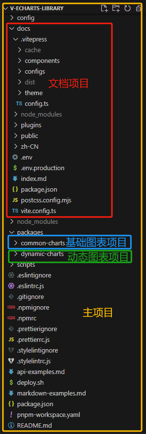
这里我以项目 v-echarts-Library 为例。首先,我们来看一下最终的目录结构,建立一个印象先:
# 一、主项目搭建
- 创建Vue3项目
npm init vite@latest
- 根据需要选择配置(这里选择了使用 TypeScript)
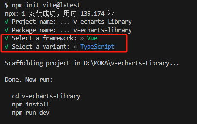
- 进入项目,安装依赖,并运行项目
  cd v-echarts-Library
  npm install
  npm run dev
2
3
此时的目录结构:

可以根据需要,集成一些其他配置,比如 .prettierrc、.stylelintrc、.eslintrc 等等。
# 二、文档项目搭建
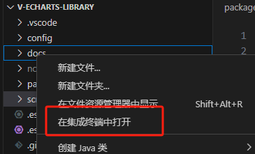
1、在根目录下创建一个 docs 文件夹,这里将会是我们的文档项目,然后进入该文件夹
2、安装vitepress,集成vitepress及完善其配置
pnpm add vitepress -D
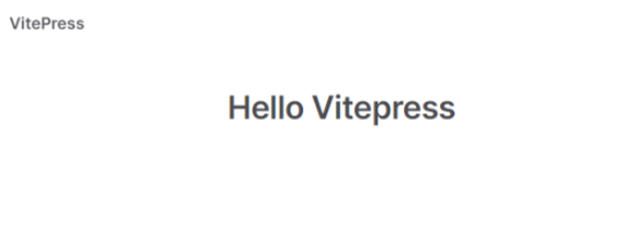
3、根目录下创建目录 docs并在 其目录中创建 index.md,其文件就是文档首页内容,可根据需要书写,测试时可先随便写点:
# Hello Vitepress
4、添加 scripts
"scripts": {
  "docs:dev": "vitepress dev docs",
  "docs:build": "vitepress build docs"
},
2
3
4
5、安装 postcss 防止vitePress 的样式去污染组件的样式
pnpm add postcss -D
6、在docs 目录下新建 postcss.config.mjs文件, 内容为:
import { postcssIsolateStyles } from 'vitepress'

export default {
    plugins: [
        postcssIsolateStyles({
            includeFiles: [/vp-doc\.css/] // defaults to /base\.css/
        })
    ]
}
2
3
4
5
6
7
8
9
7、在根目录中添加 pnpm-workspace.yaml 文件,键入如下内容:
packages: # pnpm-workspace.yaml 定义了 工作空间 的根目录,并能够使您从工作空间中包含 / 排除目录 。 默认情况下,包含所有子目录。
  - packages/* # 将 packages 目录下所有文件夹项目视为独立项目,能独立安装 node_modules
  - docs
2
3
启动vitepress文档,页面如下
# 配置 vitepress
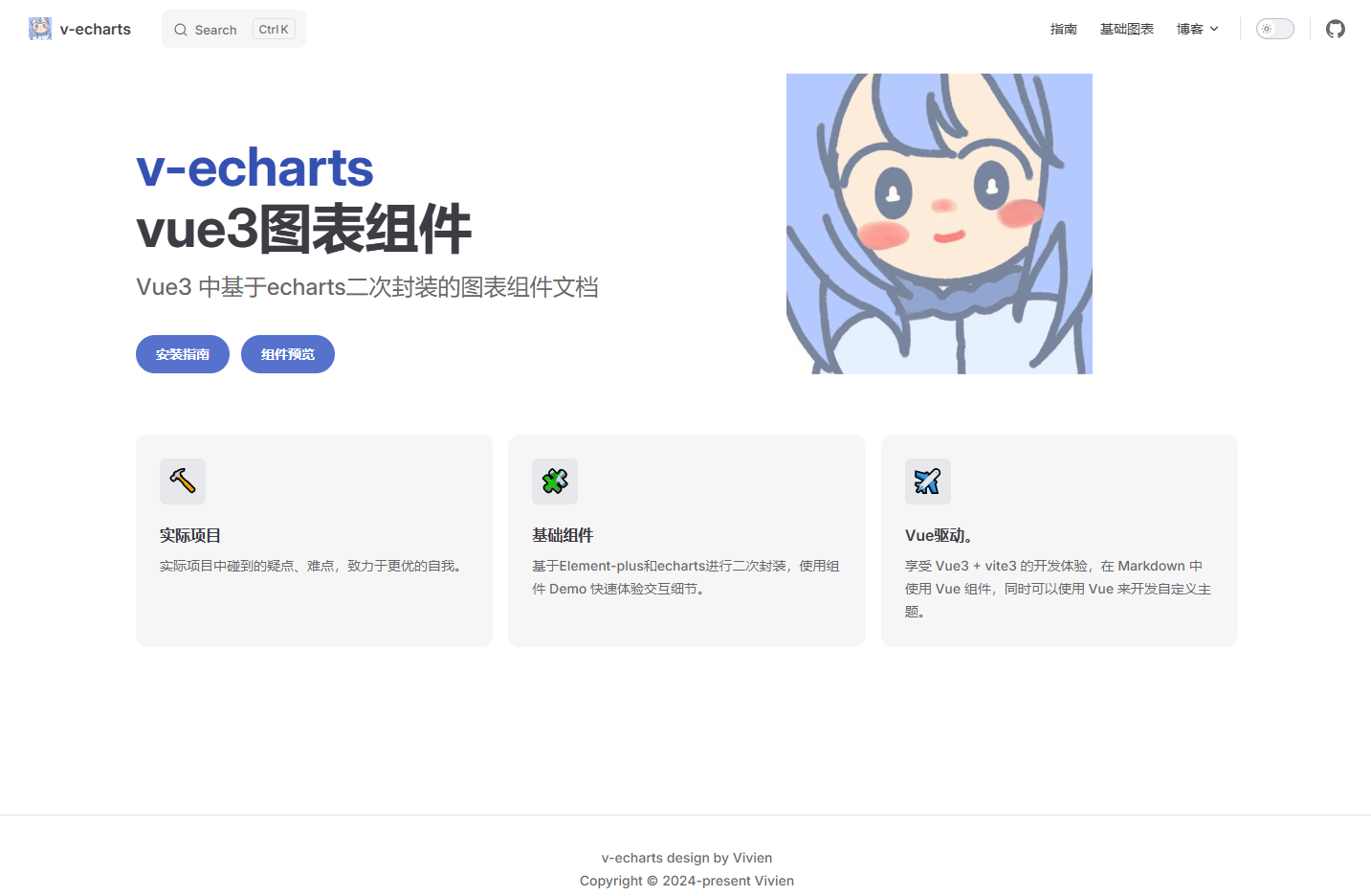
1、首页配置(即:docs/index.md文件)如下修改:
---
title: v-echarts
titleTemplate: Vue3 Charts Component Library
description: Vue3 Charts Component Library
head:
  - - meta
    - name: description
      content: v-echarts is a Vue3 Charts Component Library
  - - meta
    - name: keywords
      content: v-echarts echarts Vue3 Charts Component Library

layout: home

# titleTemplate: 选项卡描述
editLink: true
lastUpdated: true
hero:
  name: v-echarts
  text: vue3图表组件
  tagline: Vue3 中基于echarts二次封装的图表组件文档
  image:
    src: /img/avator.jpg
    alt: v-echarts
  actions:
    - theme: brand
      text: 安装指南
      link: /zh-CN/guide/howToUse
    - theme: brand
      text: 组件预览
      link: /zh-CN/components/common-charts/组件总览
features:
  - icon: 🔨
    title: 实际项目
    details: 实际项目中碰到的疑点、难点,致力于更优的自我。
  - icon: 🧩
    title: 基础组件
    details: 基于Element-plus和echarts进行二次封装,使用组件 Demo 快速体验交互细节。
  - icon: ✈️
    title: Vue驱动。
    details: 享受 Vue3 + vite3 的开发体验,在 Markdown 中使用 Vue 组件,同时可以使用 Vue 来开发自定义主题。
---
2
3
4
5
6
7
8
9
10
11
12
13
14
15
16
17
18
19
20
21
22
23
24
25
26
27
28
29
30
31
32
33
34
35
36
37
38
39
40
41
42
启动vitepress文档,页面如下
2、在 docs 目录下新建一个 zh-CN 文件夹,用来存放文档,并在其中建一个 组件使用文档components 和一个 指南手册文档guide
3、在 components 目录中创建对应组件渲染.md文件
3、在 docs 目录下新建目录 .vitepress,在该目录中创建 config.ts 文件
为了文件更加清晰,笔者将 nav、sidebar、footer 都分别成了独立的 .ts 文件,放在一个 config 文件夹中
然后再在 config.ts 文件中导入
① 配置nav(定义顶部导航)。configs/nav.ts:
export default [
{
text: '指南',
link: '/zh-CN/guide/howToUse'
},
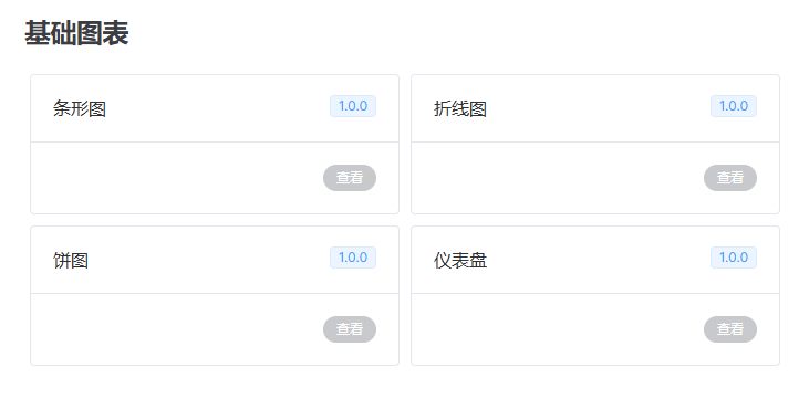
{ text: '基础图表', link: '/zh-CN/components/common-charts/test/readme' },
{
text: '博客',
items: [
{ text: 'CSDN', link: 'https://blog.csdn.net/Vivien_CC' },
{ text: 'github', link: 'https://github.com/yoguoer' },
]
}
2
3
4
5
6
7
8
9
10
11
12
13
② 配置页脚。configs/footer.ts:
export default {
message: 'v-echarts design by Vivien',
copyright: 'Copyright © 2024-present Vivien'
}
2
3
4
③ 配置侧边栏。configs/sidebar.ts:
export default {
'/zh-CN/guide': [
 {
   text:'环境准备',
   items:[
     {text:'如何使用',link:'/zh-CN/guide/howToUse'}
   ]
 },
 {
   text: '使用指南',
   items: [
     { text: '基础图表', link: '/zh-CN/guide/common-charts' },
   ]
 },
],
'/zh-CN/components/': [
 {
   text: '基础图表',
   items: [
     { text: '测试', link: '/zh-CN/components/common-charts/test/readme' },
     { text: '折线图', link: '/zh-CN/components/common-charts/Bar/readme' },
     { text: '条形图', link: '/zh-CN/components/common-charts/Line/readme' },
     { text: '饼图', link: '/zh-CN/components/common-charts/Pie/readme' },
     { text: '仪表盘', link: '/zh-CN/components/common-charts/Guage/readme' },
   ]
 },
]
}
2
3
4
5
6
7
8
9
10
11
12
13
14
15
16
17
18
19
20
21
22
23
24
25
26
27
28
④ 最终config.ts 文件如下
import { defineConfig } from 'vitepress'
import nav from './configs/nav'
import sidebar from './configs/sidebar'
import footer from './configs/footer'

export default defineConfig({
title: 'v-echarts',
description: 'v-echarts 是一个基于echarts和Vue3封装的图表组件库,主要用于快速构建数据可视化页面。',
lang: 'zh-CN',
base: `/v-echarts`,
head: [
 [
   'link',
   {
     rel: 'icon',
     href: '/img/vivien-logo.svg'
   }
 ]
],
lastUpdated: true,
themeConfig: {
 logo: '/img/vivien-logo.svg',
 // siteTitle: 'v-echarts',
 // outline: 3,
 socialLinks: [
   { icon: 'github', link: 'https://github.com/yoguoer' }
 ],
 nav,
 sidebar,
 footer,
 search: {
   provider: 'local'
 }
},
})
2
3
4
5
6
7
8
9
10
11
12
13
14
15
16
17
18
19
20
21
22
23
24
25
26
27
28
29
30
31
32
33
34
35
# 将Markdown文件中的代码示例转换为可显示在网页上的代码片段
我们使用一个插件来将 Markdown 文件中的代码示例转换为可显示在网页上的代码片段。
1、 在 docs文件夹下添加一个plugins文件夹,并创建 source-code.ts 文件,键入以下内容
import * as path from 'path'
import * as fsPromises from 'fs/promises'
import Prism from 'prismjs'
import loadLanguages from 'prismjs/components/index' // 语法高亮

loadLanguages(['markup', 'css', 'javascript'])
// 将源码使用 <pre> 标签包裹
const warp = code => `<pre v-pre><code>${code}</code></pre>`
/**
 * 实现原理是将一个字符串按照特定的模式(.*?source-code="(.*)")进行匹配,然后将匹配到的结果按照:::分割成数组
 * @param _
 * @returns
 */
function sourceSplit(_: string) {
  const result = /.*?source-code="(.*)"/.exec(_)
  const originPath = (result && result[1]) ?? ''
  return originPath.split(':::')
}

// 项目包路径
const packagesPath = path.resolve(__dirname, '../../packages/')
/**
 * 用于将 Markdown 文件中的代码示例转换为可显示在网页上的代码片段。
 * 它首先会提取模块代码中的 source-code 属性,然后读取相应的文件,并将文件内容替换到属性中。
 * 这样,浏览器就可以直接解析模块代码中的代码片段了
 * docs:https://rollupjs.org/plugin-development/#transform
 * @param src string 源代码字符串
 * @param id  string | SourceMap;
 * @returns
 */
const sourceCode = () => {
  return {

    //在每个传入模块请求时被调用  transform 钩子
    async transform(src: string, id: string) {
      const mdFile = '.md' // 文件类型
      // 文件非 markodwn 类型,返回
      if (!id.includes(mdFile)) return
      // 提取示例组件中source-code属性值
      const reg = /source-code="(.*)"/g
      // 示例组件中不存在source-code属性,返回
      if (!src.match(reg)) return
      //使用正则表达式从模块代码中提取 source-code 属性,并将其替换为实际的代码内容。
      const match = src.match(reg)?.map(_ => {
        // 获取示例组件项目名和文件地址,通过 “项目名:::组件路由地址” 进行分割
        const [packageName, compPath] = sourceSplit(_)
        // 获取项目类型,react 使用ant design 组件,使用 tsx 语法, Vue 使用
        const suffix = packageName.includes('ant') ? 'tsx' : 'vue'
        // 返回读取的文件内容
        return fsPromises.readFile(path.resolve(packagesPath, `${packageName}/demo/${compPath}.${suffix}`), 'utf-8')
      })
      const filesRes = await Promise.all(match)


      //正则表达式 /source-code="(.*)"/g 可能会匹配到多个匹配项,因此在替换时需要使用 i++ 来确保每次替换都是唯一的。
      let i = 0
      //读取模块代码中的所有文件,并将其内容合并到模块代码中

      return src.replace(reg, (str) => {

        // 获取示例组件项目名和文件地址,通过 “项目名:::组件路由地址” 进行分割
        const [packageName, compPath] = sourceSplit(str)
        // 获取示例组件地址
        const compPathStrArr = compPath.split('/')
        // iframe src 地址
        const iframeSrc = compPathStrArr[compPathStrArr.length - 1]
        // 正则匹配 @Vi-Echarts 路径别名替换为原路径
        const searchString = new RegExp(`@/Vi-Echarts/${packageName}`, 'g')
        const replaceString = `Vi-Echarts/${packageName}`
        const file = filesRes[i] ? (filesRes[i] as string).replace(searchString, replaceString) : null
        i++
        // 返回编码后的源码文件内容
        return `source-code="${encodeURIComponent(warp(Prism.highlight(file, Prism.languages.markup, 'markup')))}" raw-source="${encodeURIComponent(file)}" lib-type="${packageName}" iframe-src="${iframeSrc}"`
      })
    }
  }
}
export default sourceCode
2
3
4
5
6
7
8
9
10
11
12
13
14
15
16
17
18
19
20
21
22
23
24
25
26
27
28
29
30
31
32
33
34
35
36
37
38
39
40
41
42
43
44
45
46
47
48
49
50
51
52
53
54
55
56
57
58
59
60
61
62
63
64
65
66
67
68
69
70
71
72
73
74
75
76
77
78
2、 在 docs/vite.config.ts 中导入插件并使用
import sourceCode from './plugins/source-code'
import { defineConfig } from 'vite'
import path from 'path'
import { alias } from './plugins/alias'

export default defineConfig(async ({ command, mode }) => {
  const alia = await alias()
  return {
    server: {
      proxy: {
        '/assets': {
          target: 'http://localhost:8080',
          changeOrigin: true
        }
      }
    },
    plugins: [
      sourceCode()//将 Markdown 文件中的代码示例转换为可显示在网页上的代码片段
    ],
    resolve: {
      alias: [
        ...alia, // 统一项目包别名
        {
          find: '@/',
          replacement: path.join(__dirname, '/')
        }
      ]
    }
  }
})
2
3
4
5
6
7
8
9
10
11
12
13
14
15
16
17
18
19
20
21
22
23
24
25
26
27
28
29
30
# 封装渲染 Vue 的组件
1、在.vitepress文件夹下,新建一个components文件夹,用于存储我们的vue渲染模板

2、总体组件概况
代码如下:
<template>
  <el-row class="intro-card-container">
    <el-col :span="12" v-for="item in lists" :key="item">
      <el-card class="card-container" shadow="hover" @click="viewComponent(item.link)">
        <template #header>
          <div class="card-header">
            <span>{{ item.title }}</span>
            <el-tag v-if="item.tag" :type="item.tagType || 'primary'">
              {{ item.tag }}
            </el-tag>
          </div>
        </template>
        <div class="card-footer">
          <el-button
            :type="item.link ? 'primary' : 'info'"
            round
            :disabled="!item.link"
            @click="viewComponent(item.link)"
            >查看</el-button
          >
        </div>
      </el-card>
    </el-col>
  </el-row>
</template>

<script setup>
const props = defineProps({
  lists: {
    // 组件库名称
    type: Array,
    default: null,
  },
});

const viewComponent = (link) => {
  if (!link) {
    return false;
  }
  window && window.open(link);
};
</script>
<script>
export default {
  name: "IntroCard",
};
</script>

<style scoped lang="less">
.intro-card-container {
  display: flex;
  justify-content: flex-start;
  .card-container {
    margin: 5px;
  }
  .card-header {
    display: flex;
    justify-content: space-between;
  }
  .card-footer {
    display: flex;
    justify-content: flex-end;
  }
}
</style>
2
3
4
5
6
7
8
9
10
11
12
13
14
15
16
17
18
19
20
21
22
23
24
25
26
27
28
29
30
31
32
33
34
35
36
37
38
39
40
41
42
43
44
45
46
47
48
49
50
51
52
53
54
55
56
57
58
59
60
61
62
63
64
65
3、单个组件预览

代码如下:
<template>
<div class="container" :class="{ 'full-screen-container': isFullScreen }">
<div class="demo">
<!--操作菜单-->
<div class="menu">
<i
class="icon"
v-for="icon in iconColorArr"
:key="icon.color"
:style="{ backgroundColor: icon.color }"
>
<el-icon
v-if="icon.name === 'scale'"
class="d-caret"
@click="handleToggleFullScreen"
><DCaret
/></el-icon>
</i>
</div>
<!--demo展示组件,使用 iframe 内嵌组件-->
<iframe
class="elp-iframe"
:class="{ 'full-screen-iframe': isFullScreen }"
:src="`${baseUrl[props.libType]}#/${props.iframeSrc}`"
:style="{ height: demoHeight }"
/>
</div>
<div class="options">
<el-tooltip content="全屏预览" placement="bottom">
<el-icon class="option-item" @click="handleToggleFullScreen"
><FullScreen
/></el-icon>
</el-tooltip>
<el-tooltip content="复制代码" placement="bottom">
<el-icon class="option-item" @click="copyCode"><CopyDocument /></el-icon>
</el-tooltip>
<el-tooltip content="查看源码" placement="bottom">
<span class="option-item code-btn" @click="handleToggleCode"></></span>
</el-tooltip>
</div>
<El-collapse-transition>
<div class="source-code" v-if="isShowCode">
<!--demo 源码内嵌显示-->
<div class="decode" v-html="decoded" />
<div class="hide-code-btn">
<el-button type="info" link :icon="CaretTop" @click="handleToggleCode"
>隐藏源代码</el-button
>
</div>
</div>
</El-collapse-transition>
</div>
</template>
<script setup>
import { ref, computed, onMounted } from "vue";
import {
ElIcon,
ElTooltip,
ElCollapseTransition,
ElButton,
ElMessage,
} from "element-plus";
import { FullScreen, DCaret, CaretTop, CopyDocument } from "@element-plus/icons-vue";
import { useClipboard } from "@vueuse/core";
import "prismjs/themes/prism-tomorrow.css";
const props = defineProps({
libType: { // 组件库名称
type: String,
default: "element-plus",
},
iframeSrc: {
type: String,
default: "",
},
demoHeight: {
type: String,
default: "320px",
},
sourceCode: {
type: String,
default: "",
},
rawSource: {
type: String,
default: "",
},
});
const decoded = computed(() => {
return decodeURIComponent(props.sourceCode);
});
// 组件库 demo 构建地址
const baseUrl = {
"common-charts": import.meta.env.VITE_COMMON_DEV_BASE,
};
const iconColorArr = [
{ name: "", color: "#646cff" },
{ name: "", color: "#9499ff" },
{ name: "scale", color: "#bcc0ff" },
];
const isFullScreen = ref(false);
const isShowCode = ref(false);
//全屏预览
const handleToggleFullScreen = () => (isFullScreen.value = !isFullScreen.value);
//查看源码
const handleToggleCode = () => (isShowCode.value = !isShowCode.value);
//复制源码
const { copy, isSupported } = useClipboard({
source: decodeURIComponent(props.rawSource),
read: false,
});
const copyCode = async () => {
if (!isSupported) {
ElMessage.error("不支持复制");
}
try {
await copy();
ElMessage.success("复制成功");
} catch (e) {
ElMessage.error(e.message);
}
};
onMounted(() => {
// 监听键盘 esc键,退出全屏
document.addEventListener("keyup", (e) => {
if (e.key === "Escape" || e.key === "Esc") isFullScreen.value = false;
});
});
</script>
<script>
export default {
name: "vEchartsDemo",
};
</script>
<style scoped lang="less">
@menu-height: 32px;
.container {
border: 1px solid #dcdfe6b2;
border-radius: var(--ve-border-radius-base);
}
.full-screen-container {
position: fixed;
left: 0;
top: 0;
width: 100vw;
height: 100vh;
background-color: #fff;
z-index: 10000;
}
.demo {
.menu {
border-radius: var(--ve-border-radius-base) var(--ve-border-radius-base) 0 0;
height: @menu-height;
line-height: @menu-height;
background-color: var(--ve-custom-block-details-bg);
padding: 0 16px;
.icon {
position: relative;
display: inline-block;
width: 15px;
height: 15px;
margin-right: 5px;
&:hover {
.d-caret {
display: block;
cursor: pointer;
}
}
.d-caret {
display: none;
position: absolute;
left: 50%;
top: 50%;
transform: translate(-50%, -50%) rotate(-45deg);
color: var(--ve-c-text-2);
font-size: 13px;
}
}
}
.elp-iframe {
width: 100%;
padding: 15px;
border: 0;
}
.full-screen-iframe {
width: 100vw;
height: calc(100vh - @menu-height) !important;
}
}
.options {
border-top: 1px solid #dcdfe6b2;
height: 40px;
display: flex;
align-items: center;
justify-content: flex-end;
.option-item {
margin-right: 8px;
cursor: pointer;
color: var(--ve-c-text-2);
font-size: 12px;
&:hover {
color: var(--ve-c-text-1);
}
}
}
.source-code {
background-color: #f6f8fa;
position: relative;
border-top: 1px solid #dcdfe6b2;
.decode {
padding: 0 16px;
}
.hide-code-btn {
border-top: 1px solid #dcdfe6b2;
border-radius: 0 0 var(--ve-border-radius-base) var(--ve-border-radius-base);
position: sticky;
bottom: 0;
height: 40px;
display: flex;
align-items: center;
justify-content: center;
font-size: 14px;
background-color: var(--vp-code-block-bg);
z-index: 10;
.icon {
margin-right: 8px;
}
&::hover{
color: black;
}
}
}
</style>
2
3
4
5
6
7
8
9
10
11
12
13
14
15
16
17
18
19
20
21
22
23
24
25
26
27
28
29
30
31
32
33
34
35
36
37
38
39
40
41
42
43
44
45
46
47
48
49
50
51
52
53
54
55
56
57
58
59
60
61
62
63
64
65
66
67
68
69
70
71
72
73
74
75
76
77
78
79
80
81
82
83
84
85
86
87
88
89
90
91
92
93
94
95
96
97
98
99
100
101
102
103
104
105
106
107
108
109
110
111
112
113
114
115
116
117
118
119
120
121
122
123
124
125
126
127
128
129
130
131
132
133
134
135
136
137
138
139
140
141
142
143
144
145
146
147
148
149
150
151
152
153
154
155
156
157
158
159
160
161
162
163
164
165
166
167
168
169
170
171
172
173
174
175
176
177
178
179
180
181
182
183
184
185
186
187
188
189
190
191
192
193
194
195
196
197
198
199
200
201
202
203
204
205
206
207
208
209
210
211
212
213
214
215
216
217
218
219
220
221
222
223
224
225
226
227
228
229
230
231
232
233
234
235
236
237
238
239
240
241
4、在index.ts中导出
import vEchartsDemo from './vEcharts-demo.vue';
import IntroCard from './intro-card.vue';
export const globals = [vEchartsDemo, IntroCard];
2
3
# 三、组件项目搭建
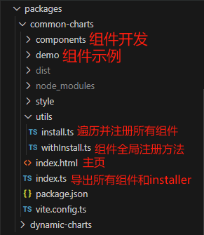
1、首先需要创建一个 packages 目录,用来存放组件,这里面是可以独立运行的项目
笔者开发的是图表组件库,分为两个项目:基础图表库 common-charts 和动态图表库 dynamic-charts
- packages
---- common-charts // 基础图表
---- dynamic-charts // 动态图表
2
3
packages 中的独立项目,搭建过程和我们的普通项目其实是一致的,也可以参考前面的住项目搭建步骤
这里只记录额外需要的部分
2、每个图表库中都有一个用于全局注册组件的文件 withInstall.ts 和用于遍历并注册组件的 install.ts, 以及最外层的用于导出所有组件的 index.ts
为了使目录结构更清晰,将 withInstall.ts 和 install.ts 放在一个utils文件夹里
① common-charts/utils/withInstall.ts
import { App, Plugin } from "vue"

// 定义一个类型,用于表示带有 install 方法的组件
type SFCWithInstall<T> = T & Plugin

// 定义一个函数,用于给组件添加 install 方法
export const withInstall = <T, E extends Record<string, any>>(main: T, extra?: E) => {
  // 给 main 添加 install 方法
  ;(main as SFCWithInstall<T>).install = (app: App) => {
    // 遍历 main 和 extra 中的组件,将它们注册到 app 中
    for (const comp of [main, ...Object.values(extra ?? {})]) {
      app.component(comp.name, comp)
    }
  }
  // 如果有 extra,则将 extra 中的组件添加到 main 中
  if (extra) {
    for (const [compName, comp] of Object.entries(extra)) {
      ;(main as Record<string, any>)[compName] = comp
    }
  }
  // 将 T 断言为具体的类型 T & plugin & Record<string, any>
  return main as SFCWithInstall<T> & E
}
2
3
4
5
6
7
8
9
10
11
12
13
14
15
16
17
18
19
20
21
22
23
② common-charts/utils/install.ts
import vEchartsTest from '../components/test'  // 导入已经开发好的组件

// 存储组件列表
const components = [
  vEchartsTest,
]

// 插件注册:在 Vue 项目的入口文件中,通过 ( app.use(插件) ) 进行注册
const installComponents = (app: any) => {
  components.forEach((comp: any) => { // 遍历并全局注册组件
    // app.component(comp.name as string, comp)
    app.use(comp)
  })
}

// 导出组件
export const installer = (app: any, router?: any) => {
  // 导出的对象必须具有 install,才能被 Vue.use() 方法安装
  installComponents(app)
}
2
3
4
5
6
7
8
9
10
11
12
13
14
15
16
17
18
19
20
③ common-charts/index.ts
export * from './components'
export { installer as commonChartsInstall } from './install'
2
目录结构如下:
# 四、组件开发
接下来,将以 common-charts 中的 test 作为例子来介绍整个过程
1、packages 中的每个文件夹,都存放着组件开发目录 components 和组件测试目录 demo
-- packages
|--- common-charts
	|--- components //组件开发目录
	|--- demo //组件测试目录
|---  dynamic-charts
	|--- components
	|--- demo
2
3
4
5
6
7
2、每个单独的组件开发目录,最外层的 index.ts 用于整合所有组件,并对外暴露出去(代码如第 5 点所示)
3、components 中的每个组件,都应该归类于单独的目录下,包含其组件源码目录 src,和 index.ts,以便于外部引用
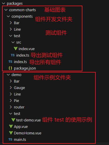
这里以组件 vEchartsTest 为例
4、在 components 和 demo 中分别新建一个 test 文件夹
- components 文件夹中:
① 最外层的 components/index.ts 用于整合并导出组件
export * from './test'
export * from './Bar'
export * from './Line'
export * from './Pie'
2
3
4
① components/test/src/index.vue 用于开发我们的组件,在这里就先随便写点东西好了(注意,组件必须声明 name,这个 name 就是组件的标签)
<template>
    <span>哈哈哈哈哈哈</span><br/>
    <el-input placeholder="hahaha" style="width: 300px;"/>
</template>

<script setup lang="ts" name="Test">
</script>
<script>
export default {
  name: "Test",
};
</script>
2
3
4
5
6
7
8
9
10
11
12
② components/test/index.ts 用于导出 test 组件
import Test from './src/index.vue' // 引入组件
import { withInstall } from '../../withInstall' // 引入 withInstall 函数

// 使用 withInstall 注册组件并导出组件
const vEchartsTest = withInstall(Test)
export default vEchartsTest
2
3
4
5
6
- demo 文件夹中:
demo /test/test-demo.vue 用于使用 test 组件,提供使用示例
注意,这里的代码将会成为文档中 ”查看源码“ 功能中见到的代码和”复制代码“功能中得到的代码
<template>
  <vEchartsTest />
</template>

<script setup lang="ts">
import vEchartsTest from '../../components/test'
</script>
2
3
4
5
6
7
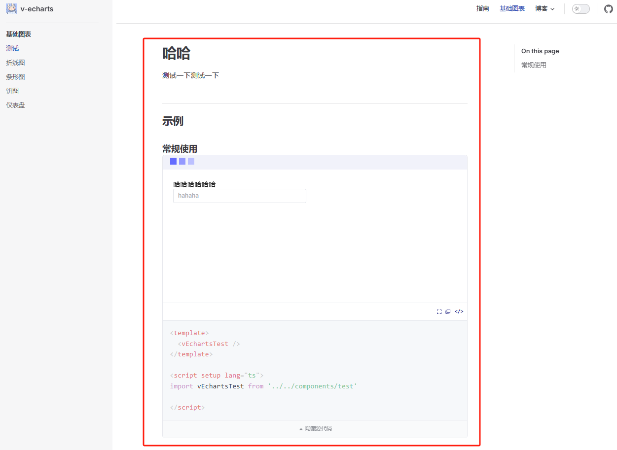
# 五、书写文档
在这里,我们使用前面已经封装好的 Vue 渲染组件来引入组件使用示例即可
# 哈哈
测试一下测试一下
## 示例

### 常规使用

<vEcharts-demo
    demo-height="300px"
    source-code="common-charts:::test/test-demo"
/>
2
3
4
5
6
7
8
9
10
效果如下:
# 六、配置路由
写完文档后,就可以在 config.ts 中配置顶部导航栏 nav 和侧边栏 sidebar 了。
这里需要根据自己的文件所在路径去配置!
笔者是创建了一个 zh-CN 文件夹,里面包含指南文档 guide 和组件文档 components(里面的目录结构又和 packages 文件夹里面的一一对应)
nav:[
	{ text: '基础图表', link: '/zh-CN/components/common-charts/test/readme' },
]
2
3
sidebar:[
	  '/zh-CN/components/': [
    {
      text: '基础图表',
      items: [
        { text: '测试', link: '/zh-CN/components/common-charts/test/readme' },
      ]
    },
  ]
]
2
3
4
5
6
7
8
9
10
# 完成
经过这些操作步骤,我们的组件库雏形就已经搭建完成啦!